
“Pop Art” is a name that seems to contradict itself. Art is frequently praised for being innovative and high-minded. Pop is regarded as a lowbrow and repetitious genre. However, the name encompasses much of what makes Pop Art design so appealing: it revels in irony and blends what shouldn’t be mixed. Pop Art design, of course, owes its greatness to more than just a snappy moniker. It’s a bright, cheeky, and eclectic style whose appeal has lasted for decades, thanks to its role in redistributing fine art from the hands of the wealthy to the general public. We’ll walk you through the origins of Pop Art and the many ways it’s still being modified today to help you get your hands on this aesthetic.
The History
Pop Art was a fine art trend that praised and criticised commercial art. This fine art trend has now been assimilated into the world of design and commercial aesthetics. The all-American vision of luxury and abundance that ruled in the 1950s and 1960s is sarcastic and alluring in equal measure. In contemporary packaging, branding, fashion, and graphic design, modern designers use this celebration of materialism with a wink and a nod. Pop Art-inspired design, rather than exploiting customers’ fears and aspirations, allows them to join in on a shared inside joke. Many of these designs, for example, use kitsch or popular culture as a visual reference.
Andy Warhol, Roy Lichtenstein, James Rosenquist, and Claes Oldenburg were among the early 1960s New York artists who contributed to pop art. Imitators jumped on the bandwagon, and their influence spread worldwide. To protest against traditional themes of morality, religion, and history, pop artists used everyday objects from popular culture as an antithesis to traditional “high art.” They celebrated mass-produced commercial items and obnoxious advertising materials as fine art. They may have discovered a new artistic aesthesia unintentionally.
Characteristics
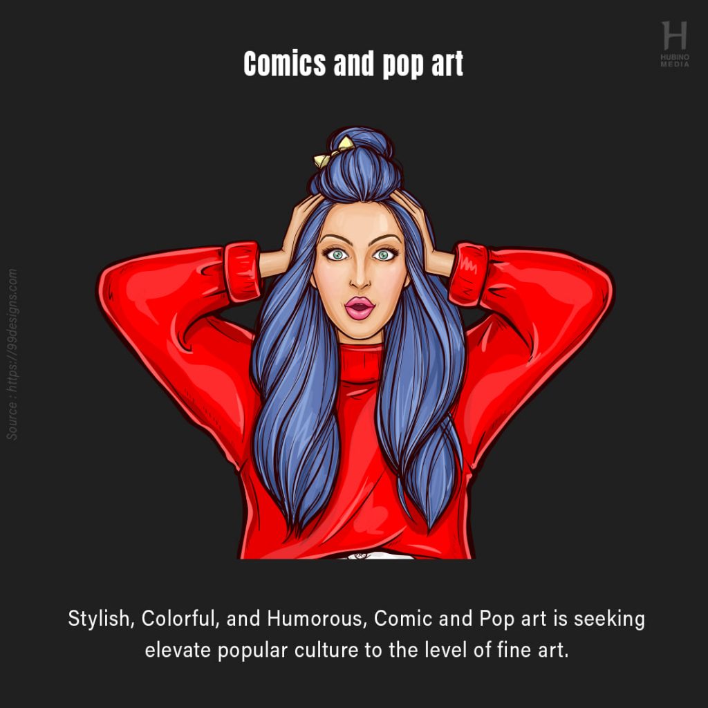
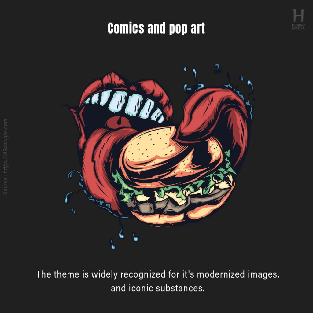
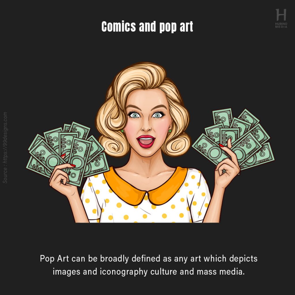
Pop Art-inspired design is all about colourful, vibrant, fun, and approachable aesthetics. The bright colours, thick outlines, and bold lettering used in this design are all eye-catching and visually appealing. Pop Art-inspired design creates a high-energy, lively, and stylish atmosphere.
Some commercial, fashion, and web designs even make direct references to well-known Pop Art works or the aesthetics of well-known Pop artists, such as artwork by Warhol or Lichtenstein. Other designers take inspiration from the earliest pieces of Pop Art, which were collaged from glossy magazines, to produce a found-image aesthetic that is surprising and humorous. Pop Art is right at home in its own source material today, popular design, with its fun attitude and eye-candy appearance.
This design technique is incredibly memorable. In other words, you’ll recognise it when you see it. It’s almost a contradiction in that the style praises everyday items while doing it with such panache that its designs stand out. You won’t find epic themes like inspirations from religion, mythology, or history in these works since it was a reaction against the high faulting themes of high art. However, because many of its well-known creators (such as Andy Warhol) have backgrounds in graphic design, the designs are vivid and pleasing to the eye. Here’s how to identify if the design you’re looking at is a pop art piece. It usually goes like this:
- Colors pop off the page.
- Interesting typography grabs your attention.
- There are a lot of crazy forms, patterns, and lines in this piece.
- Images from the mass media, advertising, commercials, and pop culture are included.
- Themes, situations, and things that are ordinary in everyday life are featured.
- Displays stylized images and sketches with a populist appeal or tone
- The distinctions between fine art and pop culture are blurred.
- Takes and borrows from a variety of sources and influences
- Is emotionally detached and lacks enthusiasm for current events.
- Is aimed at a younger demographic.
Ways to apply pop art in your designs
Their vibrant portrayals of common items and people mirrored the optimism, affluence, materialism, leisure, and consumption of postwar culture, with rich colours and sharp outlines. Pop art is noted for its bold characteristics and can help you rapidly capture the attention of your audience. Here are a few examples of how you may use them in your design, whether it’s a poster or a social media graphic.
- Use the themes of consumption and materialism to your advantage.
- Make use of celebrity culture and stardom
- Use the media as a source of inspiration.
- Display commonplace items
- Make items larger and more numerous.
- Separate the material from its surroundings.
- Images collage
- Duplicate, overlay, and mix images
- Make use of vibrant colours.
- Use bold colours and clean lines.
The talent of its contributors, though there were some incredibly creative painters working in this trend, isn’t what transformed pop art to a true design movement. It wasn’t the artistic excellence of some of their masterpieces, either, though there are a number of remarkable pieces that are still captivating today as they were back then. Pop art became a force to be reckoned with because of its outright defiance of the “good taste” of so-called fine or “high” art in the 1950s and 1960s. Rather than focusing on out-of-reach topics like religion and mythology, it appealed to people all around the world through its preoccupation with the flashy, oversaturated mass media of the day (and Campbell Soup cans!). That is most likely why artists and their audiences continue to study and admire it to this day, and will do so indefinitely.