
It’s been almost a week since Mr Steve shared his design expectations with Harry. Steve wanted a design that is alive, fresh and serene and Harry is still looking for inspiration based on which he can construct the design. Staring at the laptop for hours wasn’t helping so Harry decided to take a walk in his beautiful backyard. He sat on the lush green grass and stared at nature.
Nature has always been a source of inspiration for designers. This usage of nature-related elements in designs has been a trend for some time now, and we called it “Organic Graphic Designs.” The organic design trend is all about using shapes, colours, and textures of nature that enhances our strong connection with the world around us. From botanical illustrations to eco branding and sustainable web design, organic design is incredibly versatile and can be integrated into almost any medium, style, or technique. Well, now we know what happened to our Harry, who was staring at nature earlier.
Following are some of the widely appreciated organic graphic design trends
Natural Textures
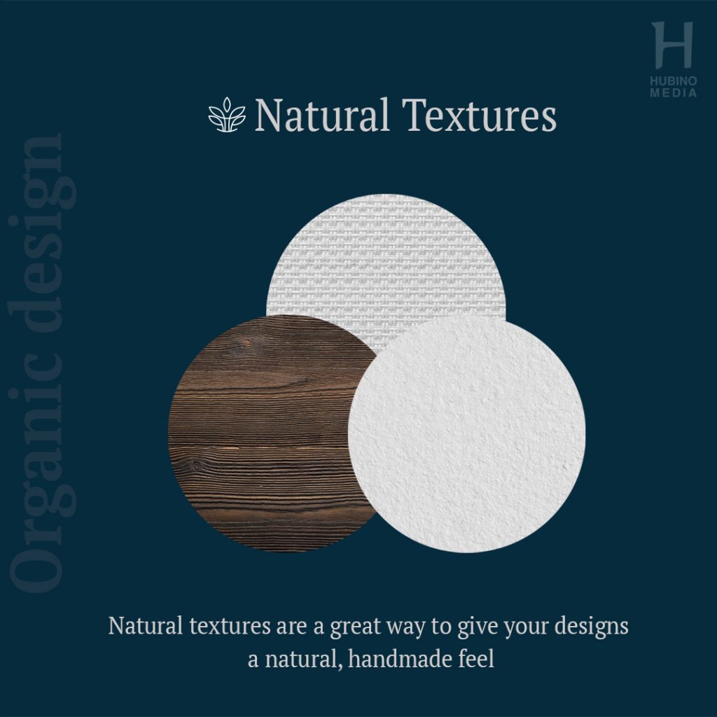
The presence of various visual elements such as colours, colours, content, images, and more is exhilarated by the presence of texture, which is a distinctive component of graphic design. It’s employed to give a surface a visual tone that reflects how it feels or is thought to feel. Natural textures, such as leaf and flower prints, twine, wood-based patterns, and other botanical prints and textures, are used in this design trend to give the graphic design a dynamic and organic appearance.
Designers are being inspired to combine natural textures with digital elements to create modern designs with a handcrafted feel. Tropicana’s logo is a good example of this style. Instead of a dot on the letter I a leaf texture is utilised to convey the impression that the product is derived from nature, giving it an organic feel.
Another great way to create depth texture is by using inspiriting colours
Neutral Colours
Colours are one of the most powerful tools in graphic design. They’re used to establish content, pique interest, generate ideas, draw attention, communicate messages, highlight elements, elicit emotion, and make a design look more appealing. Warm colours represent energy, confidence, and innovation in colour psychology, while cold colours represent serenity, calmness, and constancy.
Using the natural palette or neutral colours to emulate the essence of the natural world is one of the simplest and most effective ways to create an organic feel in your design White, taupe, beige, brown, black, pink, grey, cream, blue, and green make up the neutral colour palette. Sticking to the natural hues of the object is the simplest method to choose an effective neutral palette. This indicates that water should be blue, while plants and trees should be green.
Organic Shapes
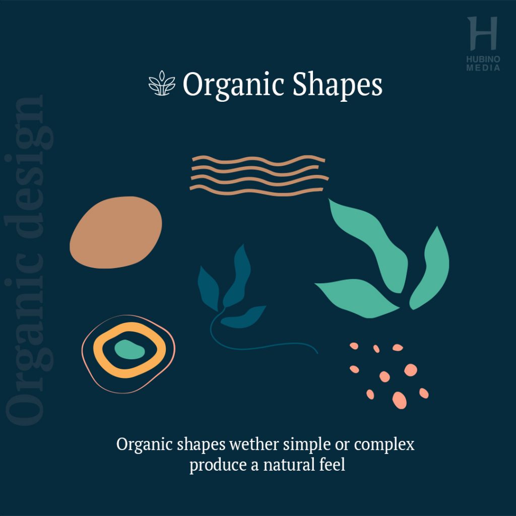
In graphic design, shapes are used to visually separate and connect the information in an appealing and ordered manner. It gives our designs texture, rhythm, depth, and movement, as well as aiding in the differentiation of distinct design parts.
Organic shapes are characterised by their free-flowing or curving appearance and are categorised as irregular or asymmetrical. Geometric pictures created by humans, on the other hand, depict perfect and uniform objects that do not exist in nature. Organic shapes evoke a feeling of serenity or naturalness. When we want to portray those feelings in a composition, we commonly use them in graphic design. The blue bird from Twitter, pouncing panther of Puma, etc are some examples of organic shapes
Botanical Design
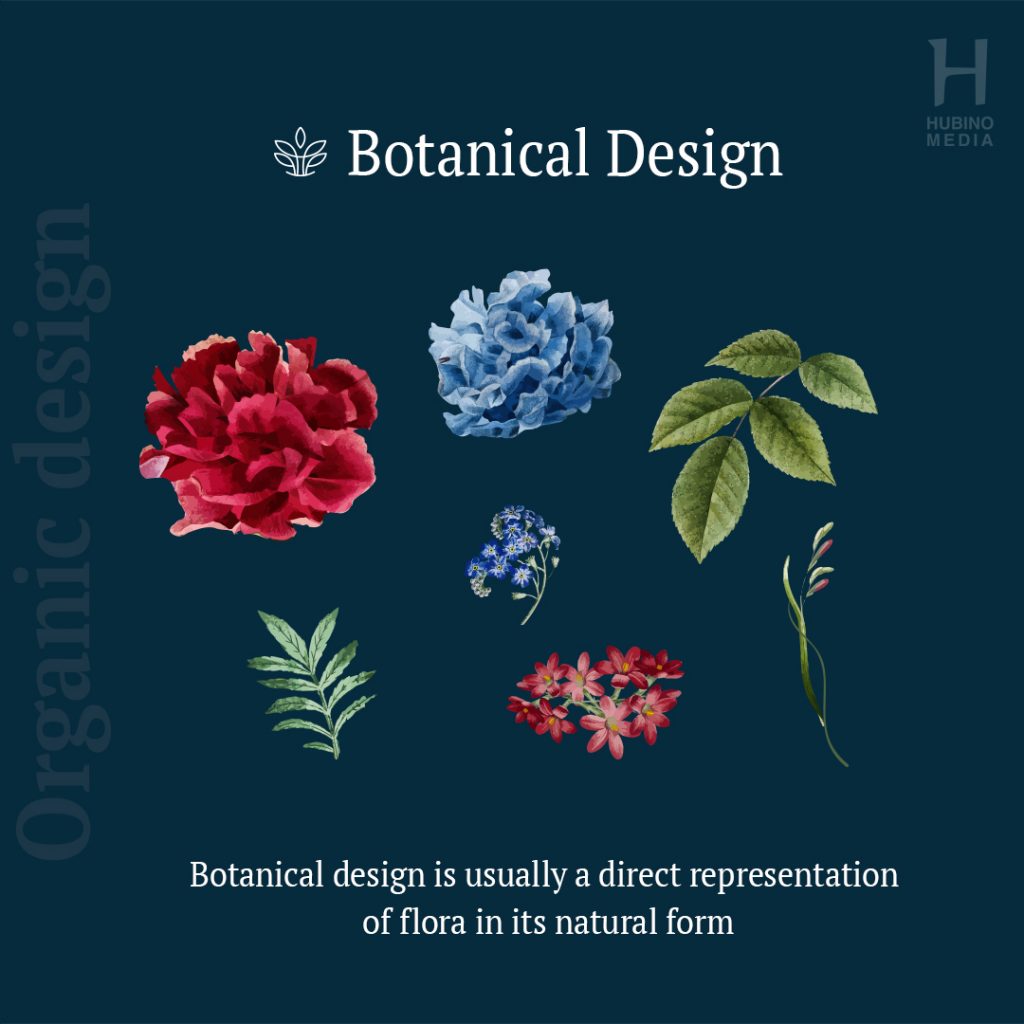
Botanical design is a term that refers to graphic designs that are influenced by plant elements. Botanical design depicts flowers, leaves, fruits, and plants in their natural state, whereas organic shapes are abstract interpretations of natural objects. Apart from the plant parts these design types also include fine lines, neutral colours, geometric shapes, as well as natural shapes and other design elements. These designs are deemed old or retro, which lets viewers feel a natural sense of nostalgia. Isn’t the famous international technology company Apple’s logo a botanical design?
When it comes to marketing, firms are frequently so preoccupied with generating a complicated graphic design that they overlook the most crucial aspect of the process: producing high-quality content for users.
Brands will be able to draw inspiration from the natural environment around them by concentrating on organic graphic design trends. Not only does this save time and resources, but it also helps brands connect with their customers by appealing to their natural instincts.
Hopefully, Harry has incorporated one or more of these trends into his design for Steve’s company. Which trend did you find the most interesting?